


KeylessUniversal
local base = 'https://raw.githubusercontent.com/17kShotsss/UI-LIBRARY/main/' -- backup, not taking any credits

local Library = loadstring(game:HttpGet(base .. 'Library.lua'))()
local ThemeManager = loadstring(game:HttpGet(base .. 'addons/ThemeManager.lua'))()
local SaveManager = loadstring(game:HttpGet(base .. 'addons/SaveManager.lua'))()

local Window = Library:CreateWindow({
    -- Set Center to true if you want the menu to appear in the center
    -- Set AutoShow to true if you want the menu to appear when it is created
    -- Position and Size are also valid options here
    -- but you do not need to define them unless you are changing them :)

    Title = 'Example menu',
    Center = true,
    AutoShow = true,
})

-- You do not have to set your tabs & groups up this way, just a prefrence.
local Tabs = {
    -- Creates a new tab titled Main
    Main = Window:AddTab('Main'),
    ['UI Settings'] = Window:AddTab('UI Settings'),
}

-- Groupbox and Tabbox inherit the same functions
-- except Tabboxes you have to call the functions on a tab (Tabbox:AddTab(name))
local LeftGroupBox = Tabs.Main:AddLeftGroupbox('Groupbox')

-- Tabboxes are a tiny bit different, but here's a basic example:
--[[
local TabBox = Tabs.Main:AddLeftTabbox() -- Add Tabbox on left side
local Tab1 = TabBox:AddTab('Tab 1')
local Tab2 = TabBox:AddTab('Tab 2')
-- You can now call AddToggle, etc on the tabs you added to the Tabbox
]]

-- Groupbox:AddToggle
-- Arguments: Index, Options
LeftGroupBox:AddToggle('MyToggle', {
    Text = 'This is a toggle',
    Default = true, -- Default value (true / false)
    Tooltip = 'This is a tooltip', -- Information shown when you hover over the toggle
})


-- Fetching a toggle object for later use:
-- Toggles.MyToggle.Value

-- Toggles is a table added to getgenv() by the library
-- You index Toggles with the specified index, in this case it is 'MyToggle'
-- To get the state of the toggle you do toggle.Value

-- Calls the passed function when the toggle is updated
Toggles.MyToggle:OnChanged(function()
    -- here we get our toggle object & then get its value
    print('MyToggle changed to:', Toggles.MyToggle.Value)
end)

-- This should print to the console: "My toggle state changed! New value: false"
Toggles.MyToggle:SetValue(false)

-- Groupbox:AddButton
-- Arguments: Text, Callback

local MyButton = LeftGroupBox:AddButton('Button', function()
    print('You clicked a button!')
end)

-- Button:AddButton
-- Arguments: Text, Callback
-- Adds a sub button to the side of the main button

local MyButton2 = MyButton:AddButton('Sub button', function()
    print('You clicked a sub button!')
end)

-- Button:AddTooltip
-- Arguments: ToolTip

MyButton:AddTooltip('This is a button')
MyButton2:AddTooltip('This is a sub button')

-- NOTE: You can chain the button methods!
--[[
    EXAMPLE:
    LeftGroupBox:AddButton('Kill all', Functions.KillAll):AddTooltip('This will kill everyone in the game!')
        :AddButton('Kick all', Functions.KickAll):AddTooltip('This will kick everyone in the game!')
]]

-- Groupbox:AddLabel
-- Arguments: Text, DoesWrap
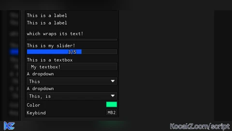
LeftGroupBox:AddLabel('This is a label')
LeftGroupBox:AddLabel('This is a label\n\nwhich wraps its text!', true)

-- Groupbox:AddDivider
-- Arguments: None
LeftGroupBox:AddDivider()

-- Groupbox:AddSlider
-- Arguments: Idx, Options
LeftGroupBox:AddSlider('MySlider', {
    Text = 'This is my slider!',

    -- Text, Default, Min, Max, Rounding must be specified.
    -- Rounding is the number of decimal places for precision.

    -- Example:
    -- Rounding 0 - 5
    -- Rounding 1 - 5.1
    -- Rounding 2 - 5.15
    -- Rounding 3 - 5.155

    Default = 0,
    Min = 0,
    Max = 5,
    Rounding = 1,

    Compact = false, -- If set to true, then it will hide the label
})

-- Options is a table added to getgenv() by the library
-- You index Options with the specified index, in this case it is 'MySlider'
-- To get the value of the slider you do slider.Value

local Number = Options.MySlider.Value
Options.MySlider:OnChanged(function()
    print('MySlider was changed! New value:', Options.MySlider.Value)
end)

-- This should print to the console: "MySlider was changed! New value: 3"
Options.MySlider:SetValue(3)

-- Groupbox:AddInput
-- Arguments: Idx, Info
LeftGroupBox:AddInput('MyTextbox', {
    Default = 'My textbox!',
    Numeric = false, -- true / false, only allows numbers
    Finished = false, -- true / false, only calls callback when you press enter

    Text = 'This is a textbox',
    Tooltip = 'This is a tooltip', -- Information shown when you hover over the textbox

    Placeholder = 'Placeholder text', -- placeholder text when the box is empty
    -- MaxLength is also an option which is the max length of the text
})

Options.MyTextbox:OnChanged(function()
    print('Text updated. New text:', Options.MyTextbox.Value)
end)

-- Groupbox:AddDropdown
-- Arguments: Idx, Info

LeftGroupBox:AddDropdown('MyDropdown', {
    Values = { 'This', 'is', 'a', 'dropdown' },
    Default = 1, -- number index of the value / string
    Multi = false, -- true / false, allows multiple choices to be selected

    Text = 'A dropdown',
    Tooltip = 'This is a tooltip', -- Information shown when you hover over the textbox
})

Options.MyDropdown:OnChanged(function()
    print('Dropdown got changed. New value:', Options.MyDropdown.Value)
end)

Options.MyDropdown:SetValue('This')

-- Multi dropdowns
LeftGroupBox:AddDropdown('MyMultiDropdown', {
    -- Default is the numeric index (e.g. "This" would be 1 since it if first in the values list)
    -- Default also accepts a string as well

    -- Currently you can not set multiple values with a dropdown

    Values = { 'This', 'is', 'a', 'dropdown' },
    Default = 1,
    Multi = true, -- true / false, allows multiple choices to be selected

    Text = 'A dropdown',
    Tooltip = 'This is a tooltip', -- Information shown when you hover over the textbox
})

Options.MyMultiDropdown:OnChanged(function()
    -- print('Dropdown got changed. New value:', )
    print('Multi dropdown got changed:')
    for key, value in next, Options.MyMultiDropdown.Value do
        print(key, value) -- should print something like This, true
    end
end)

Options.MyMultiDropdown:SetValue({
    This = true,
    is = true,
})

-- Label:AddColorPicker
-- Arguments: Idx, Info

-- You can also ColorPicker & KeyPicker to a Toggle as well

LeftGroupBox:AddLabel('Color'):AddColorPicker('ColorPicker', {
    Default = Color3.new(0, 1, 0), -- Bright green
    Title = 'Some color', -- Optional. Allows you to have a custom color picker title (when you open it)
})

Options.ColorPicker:OnChanged(function()
    print('Color changed!', Options.ColorPicker.Value)
end)

Options.ColorPicker:SetValueRGB(Color3.fromRGB(0, 255, 140))

LeftGroupBox:AddLabel('Keybind'):AddKeyPicker('KeyPicker', {
    -- SyncToggleState only works with toggles.
    -- It allows you to make a keybind which has its state synced with its parent toggle

    -- Example: Keybind which you use to toggle flyhack, etc.
    -- Changing the toggle disables the keybind state and toggling the keybind switches the toggle state

    Default = 'MB2', -- String as the name of the keybind (MB1, MB2 for mouse buttons)
    SyncToggleState = false,


    -- You can define custom Modes but I have never had a use for it.
    Mode = 'Toggle', -- Modes: Always, Toggle, Hold

    Text = 'Auto lockpick safes', -- Text to display in the keybind menu
    NoUI = false, -- Set to true if you want to hide from the Keybind menu,
})

-- OnClick is only fired when you press the keybind and the mode is Toggle
-- Otherwise, you will have to use Keybind:GetState()
Options.KeyPicker:OnClick(function()
    print('Keybind clicked!', Options.KeyPicker.Value)
end)

task.spawn(function()
    while true do
        wait(1)

        -- example for checking if a keybind is being pressed
        local state = Options.KeyPicker:GetState()
        if state then
            print('KeyPicker is being held down')
        end

        if Library.Unloaded then break end
    end
end)

Options.KeyPicker:SetValue({ 'MB2', 'Toggle' }) -- Sets keybind to MB2, mode to Hold

-- Library functions
-- Sets the watermark visibility
Library:SetWatermarkVisibility(true)

-- Sets the watermark text
Library:SetWatermark('This is a really long watermark to text the resizing')

Library.KeybindFrame.Visible = true; -- todo: add a function for this

Library:OnUnload(function()
    print('Unloaded!')
    Library.Unloaded = true
end)

-- UI Settings
local MenuGroup = Tabs['UI Settings']:AddLeftGroupbox('Menu')

-- I set NoUI so it does not show up in the keybinds menu
MenuGroup:AddButton('Unload', function() Library:Unload() end)
MenuGroup:AddLabel('Menu bind'):AddKeyPicker('MenuKeybind', { Default = 'End', NoUI = true, Text = 'Menu keybind' })

Library.ToggleKeybind = Options.MenuKeybind -- Allows you to have a custom keybind for the menu

-- Addons:
-- SaveManager (Allows you to have a configuration system)
-- ThemeManager (Allows you to have a menu theme system)

-- Hand the library over to our managers
ThemeManager:SetLibrary(Library)
SaveManager:SetLibrary(Library)

-- Ignore keys that are used by ThemeManager.
-- (we dont want configs to save themes, do we?)
SaveManager:IgnoreThemeSettings()

-- Adds our MenuKeybind to the ignore list
-- (do you want each config to have a different menu key? probably not.)
SaveManager:SetIgnoreIndexes({ 'MenuKeybind' })

-- use case for doing it this way:
-- a script hub could have themes in a global folder
-- and game configs in a separate folder per game
ThemeManager:SetFolder('MyScriptHub')
SaveManager:SetFolder('MyScriptHub/specific-game')

-- Builds our config menu on the right side of our tab
SaveManager:BuildConfigSection(Tabs['UI Settings'])

-- Builds our theme menu (with plenty of built in themes) on the left side
-- NOTE: you can also call ThemeManager:ApplyToGroupbox to add it to a specific groupbox
ThemeManager:ApplyToTab(Tabs['UI Settings'])

-- You can use the SaveManager:LoadAutoloadConfig() to load a config
-- which has been marked to be one that auto loads!

S K I D
@zxcv * off
S K I D, watch your mouth skid🥴
* off @zxcv
ts bot doesnt even like getting called as skid😧💔
Sander360, please i need this (why did you start nuking my notification)
what was that one pasted ui that was pasted from linora i forgot its name