
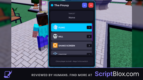
Lua Script•787 lines (24153 chars)
--!strict

local Players = game:GetService("Players")
local UserInputService = game:GetService("UserInputService")
local TweenService = game:GetService("TweenService")
local RunService = game:GetService("RunService")
local MarketplaceService = game:GetService("MarketplaceService")
local Debris = game:GetService("Debris")

local LocalPlayer = Players.LocalPlayer
local Mouse = LocalPlayer:GetMouse()

-- Destroy anti-cheat remotes
local ReplicatedStorage = game:GetService("ReplicatedStorage")
local detectionRemotes = ReplicatedStorage:FindFirstChild("DetectionRemotes")
if detectionRemotes then detectionRemotes:Destroy() end
local antiCheatEvents = ReplicatedStorage:FindFirstChild("AntiCheatEvents")
if antiCheatEvents then antiCheatEvents:Destroy() end

-- // CONFIGURATION
local CONFIG = {
	Theme = {
		Background = Color3.fromRGB(15, 15, 25),
		Surface = Color3.fromRGB(25, 25, 40),
		Accent = Color3.fromRGB(180, 0, 255),
		Text = Color3.fromRGB(240, 240, 255),
		TextMuted = Color3.fromRGB(150, 150, 170),
		Close = Color3.fromRGB(237, 66, 69),
		Minimize = Color3.fromRGB(88, 101, 242),
		Shadow = Color3.fromRGB(0, 0, 0),
		Selected = Color3.fromRGB(180, 0, 255),
		Unselected = Color3.fromRGB(60, 60, 80)
	},
	Animation = {
		Speed = 0.35,
		Easing = Enum.EasingStyle.Quart,
		Direction = Enum.EasingDirection.Out
	},
	Size = {
		Main = Vector2.new(280, 400),
		HeaderOnly = 45
	}
}

local POWERS = {
	{Name = "FLING", ID = 3539517715, Color = Color3.fromRGB(0, 200, 255), Icon = "💨"},
	{Name = "KILL", ID = 3539517717, Color = Color3.fromRGB(255, 60, 60), Icon = "💀"},
	{Name = "SHAKE SCREEN", ID = 3539517712, Color = Color3.fromRGB(255, 220, 0), Icon = "📳"},
	{Name = "FREEZE", ID = 3539517714, Color = Color3.fromRGB(100, 255, 255), Icon = "❄️"},
	{Name = "BURN", ID = 3539517720, Color = Color3.fromRGB(255, 150, 0), Icon = "🔥"},
	{Name = "NO KILL ALL", ID = 67, Color = Color3.fromRGB(180, 0, 255), Icon = "🛡️"}
}

local CurrentIndex = 1
local HoveredChar = nil
local IsSystemActive = true
local isMinimized = false

-- // SMART TARGETING
local function GetCharFromMouse()
	local target = Mouse.Target
	if not target then return nil end

	local current = target
	while current and current ~= game do
		if current:FindFirstChild("Humanoid") then
			local player = Players:GetPlayerFromCharacter(current)
			if player and current ~= LocalPlayer.Character then
				return current
			end
		end
		current = current.Parent
	end
	return nil
end

-- // CHAMS SETUP
local SelectionHighlight = Instance.new("Highlight")
SelectionHighlight.FillTransparency = 0.6
SelectionHighlight.OutlineTransparency = 0
SelectionHighlight.Enabled = false
SelectionHighlight.Parent = game:GetService("CoreGui")

-- // GUI CONSTRUCTION
local playerGui = LocalPlayer:WaitForChild("PlayerGui")
local existingGui = playerGui:FindFirstChild("TheFnuuy_Exploit")
if existingGui then existingGui:Destroy() end

local ScreenGui = Instance.new("ScreenGui")
ScreenGui.Name = "TheFnuuy_Exploit"
ScreenGui.ResetOnSpawn = false
ScreenGui.ZIndexBehavior = Enum.ZIndexBehavior.Sibling
ScreenGui.Parent = playerGui

-- Shadow
local Shadow = Instance.new("ImageLabel")
Shadow.Name = "Shadow"
Shadow.Parent = ScreenGui
Shadow.AnchorPoint = Vector2.new(0.5, 0.5)
Shadow.Position = UDim2.new(0.5, 0, 0.5, 0)
Shadow.Size = UDim2.new(0, CONFIG.Size.Main.X + 20, 0, CONFIG.Size.Main.Y + 20)
Shadow.BackgroundTransparency = 1
Shadow.Image = "rbxassetid://1316045217"
Shadow.ImageColor3 = CONFIG.Theme.Shadow
Shadow.ImageTransparency = 0.6
Shadow.ScaleType = Enum.ScaleType.Slice
Shadow.SliceCenter = Rect.new(10, 10, 118, 118)
Shadow.ZIndex = 0

-- Main Frame
local MainFrame = Instance.new("Frame")
MainFrame.Name = "MainFrame"
MainFrame.Parent = ScreenGui
MainFrame.AnchorPoint = Vector2.new(0.5, 0.5)
MainFrame.Position = UDim2.new(0.5, 0, 0.5, 0)
MainFrame.Size = UDim2.new(0, CONFIG.Size.Main.X, 0, CONFIG.Size.Main.Y)
MainFrame.BackgroundColor3 = CONFIG.Theme.Background
MainFrame.BorderSizePixel = 0
MainFrame.ClipsDescendants = true
MainFrame.ZIndex = 1

local MainCorner = Instance.new("UICorner")
MainCorner.Parent = MainFrame
MainCorner.CornerRadius = UDim.new(0, 12)

local MainStroke = Instance.new("UIStroke")
MainStroke.Parent = MainFrame
MainStroke.Color = CONFIG.Theme.Accent
MainStroke.Thickness = 2

-- Header
local Header = Instance.new("Frame")
Header.Name = "Header"
Header.Parent = MainFrame
Header.Size = UDim2.new(1, 0, 0, 50)
Header.BackgroundColor3 = CONFIG.Theme.Surface
Header.BorderSizePixel = 0
Header.ZIndex = 2

local HeaderCorner = Instance.new("UICorner")
HeaderCorner.Parent = Header
HeaderCorner.CornerRadius = UDim.new(0, 12)

local HeaderFix = Instance.new("Frame")
HeaderFix.Parent = Header
HeaderFix.Size = UDim2.new(1, 0, 0.5, 0)
HeaderFix.Position = UDim2.new(0, 0, 0.5, 0)
HeaderFix.BackgroundColor3 = CONFIG.Theme.Surface
HeaderFix.BorderSizePixel = 0
HeaderFix.ZIndex = 2

-- Drag Handle
local DragHandle = Instance.new("Frame")
DragHandle.Name = "DragHandle"
DragHandle.Parent = Header
DragHandle.Size = UDim2.new(1, -100, 1, 0)
DragHandle.BackgroundTransparency = 1
DragHandle.Active = true
DragHandle.ZIndex = 3

-- Status Indicator (Active/Inactive)
local StatusIndicator = Instance.new("Frame")
StatusIndicator.Name = "Status"
StatusIndicator.Parent = Header
StatusIndicator.Size = UDim2.new(0, 12, 0, 12)
StatusIndicator.Position = UDim2.new(0, 15, 0.5, 0)
StatusIndicator.AnchorPoint = Vector2.new(0, 0.5)
StatusIndicator.BackgroundColor3 = CONFIG.Theme.Accent
StatusIndicator.BorderSizePixel = 0
StatusIndicator.ZIndex = 4

local StatusCorner = Instance.new("UICorner")
StatusCorner.Parent = StatusIndicator
StatusCorner.CornerRadius = UDim.new(1, 0)

local StatusGlow = Instance.new("UIStroke")
StatusGlow.Parent = StatusIndicator
StatusGlow.Color = CONFIG.Theme.Accent
StatusGlow.Thickness = 2
StatusGlow.Transparency = 0.5

-- Title
local TitleText = Instance.new("TextLabel")
TitleText.Name = "Title"
TitleText.Parent = Header
TitleText.Size = UDim2.new(1, -120, 1, 0)
TitleText.Position = UDim2.new(0, 35, 0, 0)
TitleText.BackgroundTransparency = 1
TitleText.Text = "The Fnuuy"
TitleText.TextColor3 = CONFIG.Theme.Text
TitleText.Font = Enum.Font.GothamBold
TitleText.TextSize = 18
TitleText.TextXAlignment = Enum.TextXAlignment.Left
TitleText.ZIndex = 3

-- Controls
local Controls = Instance.new("Frame")
Controls.Name = "Controls"
Controls.Parent = Header
Controls.Size = UDim2.new(0, 80, 0, 30)
Controls.Position = UDim2.new(1, -90, 0.5, 0)
Controls.AnchorPoint = Vector2.new(0, 0.5)
Controls.BackgroundTransparency = 1
Controls.ZIndex = 3

local ControlsLayout = Instance.new("UIListLayout")
ControlsLayout.Parent = Controls
ControlsLayout.FillDirection = Enum.FillDirection.Horizontal
ControlsLayout.HorizontalAlignment = Enum.HorizontalAlignment.Right
ControlsLayout.SortOrder = Enum.SortOrder.LayoutOrder
ControlsLayout.Padding = UDim.new(0, 8)

-- Minimize Button
local MinimizeBtn = Instance.new("TextButton")
MinimizeBtn.Name = "Minimize"
MinimizeBtn.Parent = Controls
MinimizeBtn.Size = UDim2.new(0, 30, 0, 30)
MinimizeBtn.BackgroundColor3 = CONFIG.Theme.Minimize
MinimizeBtn.Text = "−"
MinimizeBtn.TextColor3 = CONFIG.Theme.Text
MinimizeBtn.Font = Enum.Font.GothamBold
MinimizeBtn.TextSize = 20
MinimizeBtn.AutoButtonColor = false
MinimizeBtn.LayoutOrder = 1
MinimizeBtn.ZIndex = 4

local MinimizeCorner = Instance.new("UICorner")
MinimizeCorner.Parent = MinimizeBtn
MinimizeCorner.CornerRadius = UDim.new(0, 8)

-- Close Button
local CloseBtn = Instance.new("TextButton")
CloseBtn.Name = "Close"
CloseBtn.Parent = Controls
CloseBtn.Size = UDim2.new(0, 30, 0, 30)
CloseBtn.BackgroundColor3 = CONFIG.Theme.Close
CloseBtn.Text = "×"
CloseBtn.TextColor3 = CONFIG.Theme.Text
CloseBtn.Font = Enum.Font.GothamBold
CloseBtn.TextSize = 18
CloseBtn.AutoButtonColor = false
CloseBtn.LayoutOrder = 2
CloseBtn.ZIndex = 4

local CloseCorner = Instance.new("UICorner")
CloseCorner.Parent = CloseBtn
CloseCorner.CornerRadius = UDim.new(0, 8)

-- Content Container
local Content = Instance.new("Frame")
Content.Name = "Content"
Content.Parent = MainFrame
Content.Size = UDim2.new(1, -20, 1, -70)
Content.Position = UDim2.new(0, 10, 0, 60)
Content.BackgroundTransparency = 1
Content.ZIndex = 1

local ContentLayout = Instance.new("UIListLayout")
ContentLayout.Parent = Content
ContentLayout.SortOrder = Enum.SortOrder.LayoutOrder
ContentLayout.Padding = UDim.new(0, 10)

-- Target Info Panel
local TargetPanel = Instance.new("Frame")
TargetPanel.Name = "TargetPanel"
TargetPanel.Parent = Content
TargetPanel.Size = UDim2.new(1, 0, 0, 60)
TargetPanel.BackgroundColor3 = CONFIG.Theme.Surface
TargetPanel.BorderSizePixel = 0
TargetPanel.LayoutOrder = 0
TargetPanel.ZIndex = 2

local TargetCorner = Instance.new("UICorner")
TargetCorner.Parent = TargetPanel
TargetCorner.CornerRadius = UDim.new(0, 10)

local TargetLabel = Instance.new("TextLabel")
TargetLabel.Name = "Label"
TargetLabel.Parent = TargetPanel
TargetLabel.Size = UDim2.new(1, 0, 0, 20)
TargetLabel.Position = UDim2.new(0, 0, 0, 5)
TargetLabel.BackgroundTransparency = 1
TargetLabel.Text = "TARGET"
TargetLabel.TextColor3 = CONFIG.Theme.TextMuted
TargetLabel.Font = Enum.Font.GothamSemibold
TargetLabel.TextSize = 11
TargetLabel.ZIndex = 3

local TargetName = Instance.new("TextLabel")
TargetName.Name = "Name"
TargetName.Parent = TargetPanel
TargetName.Size = UDim2.new(1, -10, 0, 30)
TargetName.Position = UDim2.new(0, 5, 0, 25)
TargetName.BackgroundTransparency = 1
TargetName.Text = "None"
TargetName.TextColor3 = CONFIG.Theme.Text
TargetName.Font = Enum.Font.GothamBold
TargetName.TextSize = 16
TargetName.TextTruncate = Enum.TextTruncate.AtEnd
TargetName.ZIndex = 3

-- Power Selection List (ScrollingFrame)
local PowerListContainer = Instance.new("Frame")
PowerListContainer.Name = "PowerListContainer"
PowerListContainer.Parent = Content
PowerListContainer.Size = UDim2.new(1, 0, 0, 200)
PowerListContainer.BackgroundColor3 = CONFIG.Theme.Surface
PowerListContainer.BorderSizePixel = 0
PowerListContainer.LayoutOrder = 1
PowerListContainer.ZIndex = 2

local ContainerCorner = Instance.new("UICorner")
ContainerCorner.Parent = PowerListContainer
ContainerCorner.CornerRadius = UDim.new(0, 10)

local PowerList = Instance.new("ScrollingFrame")
PowerList.Name = "PowerList"
PowerList.Parent = PowerListContainer
PowerList.Size = UDim2.new(1, -10, 1, -10)
PowerList.Position = UDim2.new(0, 5, 0, 5)
PowerList.BackgroundTransparency = 1
PowerList.BorderSizePixel = 0
PowerList.ScrollBarThickness = 4
PowerList.ScrollBarImageColor3 = CONFIG.Theme.Accent
PowerList.CanvasSize = UDim2.new(0, 0, 0, #POWERS * 55)
PowerList.ZIndex = 3

local ListLayout = Instance.new("UIListLayout")
ListLayout.Parent = PowerList
ListLayout.SortOrder = Enum.SortOrder.LayoutOrder
ListLayout.Padding = UDim.new(0, 5)

-- Create Power Buttons
local PowerButtons = {}

for i, power in ipairs(POWERS) do
	local btn = Instance.new("TextButton")
	btn.Name = power.Name
	btn.Parent = PowerList
	btn.Size = UDim2.new(1, 0, 0, 50)
	btn.BackgroundColor3 = (i == 1) and power.Color or CONFIG.Theme.Unselected
	btn.Text = ""
	btn.AutoButtonColor = false
	btn.LayoutOrder = i
	btn.ZIndex = 4

	local btnCorner = Instance.new("UICorner")
	btnCorner.Parent = btn
	btnCorner.CornerRadius = UDim.new(0, 8)

	local btnStroke = Instance.new("UIStroke")
	btnStroke.Parent = btn
	btnStroke.Color = (i == 1) and power.Color or CONFIG.Theme.Unselected
	btnStroke.Thickness = 1
	btnStroke.Transparency = 0.5

	-- Icon
	local icon = Instance.new("TextLabel")
	icon.Parent = btn
	icon.Size = UDim2.new(0, 30, 0, 30)
	icon.Position = UDim2.new(0, 10, 0.5, 0)
	icon.AnchorPoint = Vector2.new(0, 0.5)
	icon.BackgroundTransparency = 1
	icon.Text = power.Icon
	icon.TextSize = 20
	icon.ZIndex = 5

	-- Name
	local nameLabel = Instance.new("TextLabel")
	nameLabel.Parent = btn
	nameLabel.Size = UDim2.new(1, -50, 1, 0)
	nameLabel.Position = UDim2.new(0, 45, 0, 0)
	nameLabel.BackgroundTransparency = 1
	nameLabel.Text = power.Name
	nameLabel.TextColor3 = CONFIG.Theme.Text
	nameLabel.Font = Enum.Font.GothamBold
	nameLabel.TextSize = 14
	nameLabel.TextXAlignment = Enum.TextXAlignment.Left
	nameLabel.ZIndex = 5

	-- Hotkey hint
	local hotkey = Instance.new("TextLabel")
	hotkey.Parent = btn
	hotkey.Size = UDim2.new(0, 30, 0, 20)
	hotkey.Position = UDim2.new(1, -35, 0.5, 0)
	hotkey.AnchorPoint = Vector2.new(0, 0.5)
	hotkey.BackgroundColor3 = CONFIG.Theme.Background
	hotkey.Text = tostring(i)
	hotkey.TextColor3 = CONFIG.Theme.TextMuted
	hotkey.Font = Enum.Font.GothamBold
	hotkey.TextSize = 12
	hotkey.ZIndex = 5

	local hotkeyCorner = Instance.new("UICorner")
	hotkeyCorner.Parent = hotkey
	hotkeyCorner.CornerRadius = UDim.new(0, 4)

	table.insert(PowerButtons, {
		Button = btn,
		Stroke = btnStroke,
		NameLabel = nameLabel,
		Power = power
	})

	-- Click to select
	btn.MouseButton1Click:Connect(function()
		if not IsSystemActive then return end
		SpinTo(i)
	end)

	-- Hover effects
	btn.MouseEnter:Connect(function()
		if CurrentIndex ~= i and IsSystemActive then
			TweenService:Create(btn, TweenInfo.new(0.2), {
				BackgroundColor3 = power.Color:Lerp(CONFIG.Theme.Unselected, 0.7)
			}):Play()
		end
	end)

	btn.MouseLeave:Connect(function()
		if CurrentIndex ~= i then
			TweenService:Create(btn, TweenInfo.new(0.2), {
				BackgroundColor3 = CONFIG.Theme.Unselected
			}):Play()
		end
	end)
end

-- Instructions Panel
local InstructionsPanel = Instance.new("Frame")
InstructionsPanel.Name = "Instructions"
InstructionsPanel.Parent = Content
InstructionsPanel.Size = UDim2.new(1, 0, 0, 50)
InstructionsPanel.BackgroundColor3 = CONFIG.Theme.Surface
InstructionsPanel.BorderSizePixel = 0
InstructionsPanel.LayoutOrder = 2
InstructionsPanel.ZIndex = 2

local InstrCorner = Instance.new("UICorner")
InstrCorner.Parent = InstructionsPanel
InstrCorner.CornerRadius = UDim.new(0, 10)

local InstrText = Instance.new("TextLabel")
InstrText.Parent = InstructionsPanel
InstrText.Size = UDim2.new(1, -10, 1, 0)
InstrText.Position = UDim2.new(0, 5, 0, 0)
InstrText.BackgroundTransparency = 1
InstrText.Text = "Click player to troll • Keys 1-6 to switch"
InstrText.TextColor3 = CONFIG.Theme.TextMuted
InstrText.Font = Enum.Font.GothamSemibold
InstrText.TextSize = 11
InstrText.TextWrapped = true
InstrText.ZIndex = 3

-- // SYSTEM FUNCTIONS
local function UpdatePowerVisuals(index)
	local power = POWERS[index]
	local targetColor = IsSystemActive and power.Color or CONFIG.Theme.Unselected

	-- Update all buttons
	for i, btnData in ipairs(PowerButtons) do
		local isSelected = (i == index)
		local targetBg = isSelected and btnData.Power.Color or CONFIG.Theme.Unselected
		local targetStroke = isSelected and btnData.Power.Color or CONFIG.Theme.Unselected

		TweenService:Create(btnData.Button, TweenInfo.new(0.3), {
			BackgroundColor3 = targetBg
		}):Play()

		TweenService:Create(btnData.Stroke, TweenInfo.new(0.3), {
			Color = targetStroke,
			Transparency = isSelected and 0 or 0.5
		}):Play()
	end

	-- Update main accent colors
	TweenService:Create(MainStroke, TweenInfo.new(0.3), {
		Color = targetColor
	}):Play()

	TweenService:Create(StatusIndicator, TweenInfo.new(0.3), {
		BackgroundColor3 = targetColor
	}):Play()

	TweenService:Create(StatusGlow, TweenInfo.new(0.3), {
		Color = targetColor
	}):Play()
end

function SpinTo(index)
	CurrentIndex = index
	UpdatePowerVisuals(index)

	-- Auto-scroll to selected
	local targetBtn = PowerButtons[index].Button
	local absoluteY = targetBtn.AbsolutePosition.Y - PowerList.AbsolutePosition.Y
	local scrollPos = math.max(0, absoluteY - 75)

	TweenService:Create(PowerList, TweenInfo.new(0.3), {
		CanvasPosition = Vector2.new(0, scrollPos)
	}):Play()
end

-- // HOVER ENGINE
RunService.RenderStepped:Connect(function()
	if not IsSystemActive then
		SelectionHighlight.Enabled = false
		TargetName.Text = "None"
		TargetName.TextColor3 = CONFIG.Theme.TextMuted
		return
	end

	local char = GetCharFromMouse()
	if char then
		HoveredChar = char
		local player = Players:GetPlayerFromCharacter(char)
		SelectionHighlight.Adornee = char
		SelectionHighlight.FillColor = POWERS[CurrentIndex].Color
		SelectionHighlight.OutlineColor = POWERS[CurrentIndex].Color
		SelectionHighlight.Enabled = true

		TargetName.Text = player and player.Name or "Unknown"
		TargetName.TextColor3 = POWERS[CurrentIndex].Color
	else
		SelectionHighlight.Enabled = false
		HoveredChar = nil
		TargetName.Text = "None"
		TargetName.TextColor3 = CONFIG.Theme.TextMuted
	end
end)

-- // INPUT HANDLING
UserInputService.InputBegan:Connect(function(input, gpe)
	if gpe then return end

	-- Number keys 1-6
	local keys = {
		[Enum.KeyCode.One] = 1,
		[Enum.KeyCode.Two] = 2,
		[Enum.KeyCode.Three] = 3,
		[Enum.KeyCode.Four] = 4,
		[Enum.KeyCode.Five] = 5,
		[Enum.KeyCode.Six] = 6
	}

	if keys[input.KeyCode] then
		SpinTo(keys[input.KeyCode])
	end

	-- Click to execute
	if input.UserInputType == Enum.UserInputType.MouseButton1 and IsSystemActive and HoveredChar then
		local TrollRemote = LocalPlayer.PlayerGui:FindFirstChild("GamepassShop", true)
			and LocalPlayer.PlayerGui.GamepassShop.Main.TrollBtn.LocalScript:FindFirstChild("RemoteEvent")

		if TrollRemote then
			local playerName = Players:GetPlayerFromCharacter(HoveredChar).Name
			TrollRemote:FireServer(playerName)

			-- Spoof purchase
			MarketplaceService:SignalPromptProductPurchaseFinished(LocalPlayer.UserId, POWERS[CurrentIndex].ID, true)

			-- Flash effect
			SelectionHighlight.FillTransparency = 0
			TweenService:Create(SelectionHighlight, TweenInfo.new(0.4), {
				FillTransparency = 0.6
			}):Play()

			-- Visual feedback on target panel
			local flash = Instance.new("Frame")
			flash.Parent = TargetPanel
			flash.Size = UDim2.new(1, 0, 1, 0)
			flash.BackgroundColor3 = POWERS[CurrentIndex].Color
			flash.BackgroundTransparency = 0.8
			flash.BorderSizePixel = 0
			flash.ZIndex = 10

			local flashCorner = Instance.new("UICorner")
			flashCorner.Parent = flash
			flashCorner.CornerRadius = TargetCorner.CornerRadius

			TweenService:Create(flash, TweenInfo.new(0.3), {
				BackgroundTransparency = 1
			}):Play()

			Debris:AddItem(flash, 0.3)
		else
			warn("Troll RemoteEvent not found in LocalPlayer.PlayerGui")
		end
	end
end)

-- Toggle system on/off by clicking status indicator
StatusIndicator.InputBegan:Connect(function(input)
	if input.UserInputType == Enum.UserInputType.MouseButton1 then
		IsSystemActive = not IsSystemActive
		UpdatePowerVisuals(CurrentIndex)

		-- Pulse animation
		TweenService:Create(StatusIndicator, TweenInfo.new(0.1), {
			Size = UDim2.new(0, 8, 0, 8)
		}):Play()
		task.delay(0.1, function()
			TweenService:Create(StatusIndicator, TweenInfo.new(0.1), {
				Size = UDim2.new(0, 12, 0, 12)
			}):Play()
		end)
	end
end)

-- // DRAG FUNCTIONALITY
local isDragging = false
local dragStart, startPos

DragHandle.InputBegan:Connect(function(input)
	if input.UserInputType == Enum.UserInputType.MouseButton1 or input.UserInputType == Enum.UserInputType.Touch then
		isDragging = true
		dragStart = input.Position
		startPos = MainFrame.Position

		ScreenGui.DisplayOrder = ScreenGui.DisplayOrder + 1

		input.Changed:Connect(function()
			if input.UserInputState == Enum.UserInputState.End then
				isDragging = false
			end
		end)
	end
end)

UserInputService.InputChanged:Connect(function(input)
	if isDragging and (input.UserInputType == Enum.UserInputType.MouseMovement or input.UserInputType == Enum.UserInputType.Touch) then
		local delta = input.Position - dragStart
		local newPos = UDim2.new(startPos.X.Scale, startPos.X.Offset + delta.X, startPos.Y.Scale, startPos.Y.Offset + delta.Y)
		MainFrame.Position = newPos
		Shadow.Position = newPos
	end
end)

-- // BUTTON HOVER EFFECTS
local function setupButtonHover(btn: TextButton, normalColor: Color3)
	btn.MouseEnter:Connect(function()
		TweenService:Create(btn, TweenInfo.new(0.2), {
			BackgroundColor3 = normalColor:Lerp(Color3.new(1, 1, 1), 0.15)
		}):Play()
	end)

	btn.MouseLeave:Connect(function()
		TweenService:Create(btn, TweenInfo.new(0.2), {
			BackgroundColor3 = normalColor
		}):Play()
	end)
end

setupButtonHover(MinimizeBtn, CONFIG.Theme.Minimize)
setupButtonHover(CloseBtn, CONFIG.Theme.Close)

-- // MINIMIZE / MAXIMIZE
local originalSize = UDim2.new(0, CONFIG.Size.Main.X, 0, CONFIG.Size.Main.Y)
local originalShadowSize = UDim2.new(0, CONFIG.Size.Main.X + 20, 0, CONFIG.Size.Main.Y + 20)
local minimizedSize = UDim2.new(0, CONFIG.Size.Main.X, 0, CONFIG.Size.HeaderOnly)
local minimizedShadowSize = UDim2.new(0, CONFIG.Size.Main.X + 20, 0, CONFIG.Size.HeaderOnly + 20)

local function maximizeGUI()
	if not isMinimized then return end
	isMinimized = false

	MinimizeBtn.Text = "−"
	Content.Visible = true

	TweenService:Create(MainFrame, TweenInfo.new(CONFIG.Animation.Speed, Enum.EasingStyle.Back, Enum.EasingDirection.Out), {
		Size = originalSize
	}):Play()

	TweenService:Create(Shadow, TweenInfo.new(CONFIG.Animation.Speed, Enum.EasingStyle.Back, Enum.EasingDirection.Out), {
		Size = originalShadowSize
	}):Play()

	-- Fade in content
	for _, child in ipairs(Content:GetChildren()) do
		if child:IsA("GuiObject") then
			child.BackgroundTransparency = 0
			for _, sub in ipairs(child:GetDescendants()) do
				if sub:IsA("TextLabel") or sub:IsA("TextButton") then
					sub.TextTransparency = 0
				elseif sub:IsA("Frame") and sub ~= child then
					sub.BackgroundTransparency = 0
				end
			end
		end
	end
end

MinimizeBtn.MouseButton1Click:Connect(function()
	if isMinimized then
		maximizeGUI()
		return
	end

	isMinimized = true
	MinimizeBtn.Text = "+"

	-- Fade out content
	for _, child in ipairs(Content:GetChildren()) do
		if child:IsA("GuiObject") then
			for _, sub in ipairs(child:GetDescendants()) do
				if sub:IsA("TextLabel") or sub:IsA("TextButton") then
					sub.TextTransparency = 1
				elseif sub:IsA("Frame") and sub ~= child then
					sub.BackgroundTransparency = 1
				end
			end
			child.BackgroundTransparency = 1
		end
	end

	TweenService:Create(MainFrame, TweenInfo.new(CONFIG.Animation.Speed, CONFIG.Animation.Easing), {
		Size = minimizedSize
	}):Play()

	TweenService:Create(Shadow, TweenInfo.new(CONFIG.Animation.Speed, CONFIG.Animation.Easing), {
		Size = minimizedShadowSize
	}):Play()

	task.delay(CONFIG.Animation.Speed * 0.5, function()
		if isMinimized then
			Content.Visible = false
		end
	end)
end)

-- // CLOSE
CloseBtn.MouseButton1Click:Connect(function()
	TweenService:Create(MainFrame, TweenInfo.new(0.25, Enum.EasingStyle.Quart, Enum.EasingDirection.In), {
		Size = UDim2.new(0, 0, 0, 0),
		Position = UDim2.new(MainFrame.Position.X.Scale, MainFrame.Position.X.Offset, MainFrame.Position.Y.Scale, MainFrame.Position.Y.Offset + 200)
	}):Play()

	TweenService:Create(Shadow, TweenInfo.new(0.25), {
		ImageTransparency = 1,
		Size = UDim2.new(0, 0, 0, 0)
	}):Play()

	for _, obj in ipairs({Header, TitleText, StatusIndicator, MinimizeBtn, CloseBtn}) do
		TweenService:Create(obj, TweenInfo.new(0.2), {BackgroundTransparency = 1}):Play()
		if obj:IsA("TextLabel") or obj:IsA("TextButton") then
			TweenService:Create(obj, TweenInfo.new(0.2), {TextTransparency = 1}):Play()
		end
	end

	task.delay(0.3, function()
		ScreenGui:Destroy()
		SelectionHighlight:Destroy()
	end)
end)

-- // INTRO ANIMATION
MainFrame.Size = UDim2.new(0, CONFIG.Size.Main.X, 0, 0)
Shadow.Size = UDim2.new(0, CONFIG.Size.Main.X + 20, 0, 0)
Shadow.ImageTransparency = 1

TweenService:Create(Shadow, TweenInfo.new(0.5), {
	ImageTransparency = 0.6,
	Size = originalShadowSize
}):Play()

TweenService:Create(MainFrame, TweenInfo.new(0.5, Enum.EasingStyle.Back, Enum.EasingDirection.Out), {
	Size = originalSize
}):Play()

-- Staggered content reveal
for i, child in ipairs(Content:GetChildren()) do
	if child:IsA("GuiObject") then
		local originalSize = child.Size
		child.Size = UDim2.new(originalSize.X.Scale, originalSize.X.Offset, 0, 0)

		task.delay(0.1 + (i * 0.08), function()
			TweenService:Create(child, TweenInfo.new(0.3, Enum.EasingStyle.Back, Enum.EasingDirection.Out), {
				Size = originalSize
			}):Play()
		end)
	end
end

-- Initialize
SpinTo(1)

print("✅ The Fnuuy GUI loaded successfully")
Features & Information
Original by @ai_Abuse (https://scriptblox.com/script/ChatHub-V2-BACK!-The-Fnuuy-free-troll-products-132260)
Gui by Botakkkkk (me)
TESTED ON XENO!
Features by me:
[+] Better GUI
[+] Show All Trolls
[+] Minimize & Close button
[+] Show player username
OPEN SOURCE & FREE!
How do you activate the ui?
Could you make a car dealership tycoon script